Soft Spaces, High Color

Originally published by WHY Architecture
SOFT SPACES, HIGH COLOR
The texture of cinematic space at the Academy Museum of Motion Pictures
Cinemas are soft spaces. Carpeted floors, upholstered walls, seats that swallow you up, and a softness that describes the darkness itself – there’s a velvety tactility to it, set against the sharpness of the images on screen.
The use of fabrics in a cinema auditorium is primarily for acoustic absorption, preventing distracting echoes and managing the way that sound travels through space. The Stories of Cinema galleries at the Academy Museum of Motion Pictures reinterpret those qualities for the museum environment, where multiple simultaneous sound sources require highly calibrated acoustic control. While serving a functional purpose, the use of fabrics became an opportunity to play with color, narrative, and emotion; whether emphasizing spatial depth or illuminating an exhibit, each selected shade plays a supporting role in the storytelling.
Here are a series of snippets from our color palette, creating a chromatic cocoon that actively shapes the space and contains the visitor’s experience.

EMERALD CITY GREEN
One of the most comprehensive instances of cinema storytelling is The Art of Moviemaking Gallery on the second floor, taking the visitor on a backstage tour of The Wizard of Oz. A key factor of that “behind the scenes” feeling is the sweeping green curtain that hovers lightly above the ground, ready to reveal the inner workings of the movie. “Colors throughout galleries are exaggerated to increase vivacity – they’re never a direct copy,” explains Exhibition Designer, Jarrod Beck. “Here, we chose a wonderful deep emerald velour. The color really reaches out to you, bringing you back to those scenes in the movie.”
“The curtain has a magical quality and a sense of flow, but it also contains an inner steel frame which allows it to serve as a structural element,” says Paula Neston, Technical Design Director at Cinnabar. “Drawing from their archive, the museum gave us a reference for what Emerald City Green might look like and we went through a process of custom dying to reach that shade – but none of the greens were quite right, they just weren’t rich enough. The color we eventually chose is darker than the green in the movie; after experimenting with lighting and hanging the fabric, we found that it conjured exactly the atmosphere we were searching for. If we’d stayed with those original technicolor greens, it would have cheapened the overall effect and wouldn’t have sparked that strong contrast with the golds and deep saturation of the Yellow Brick Road backdrop.”

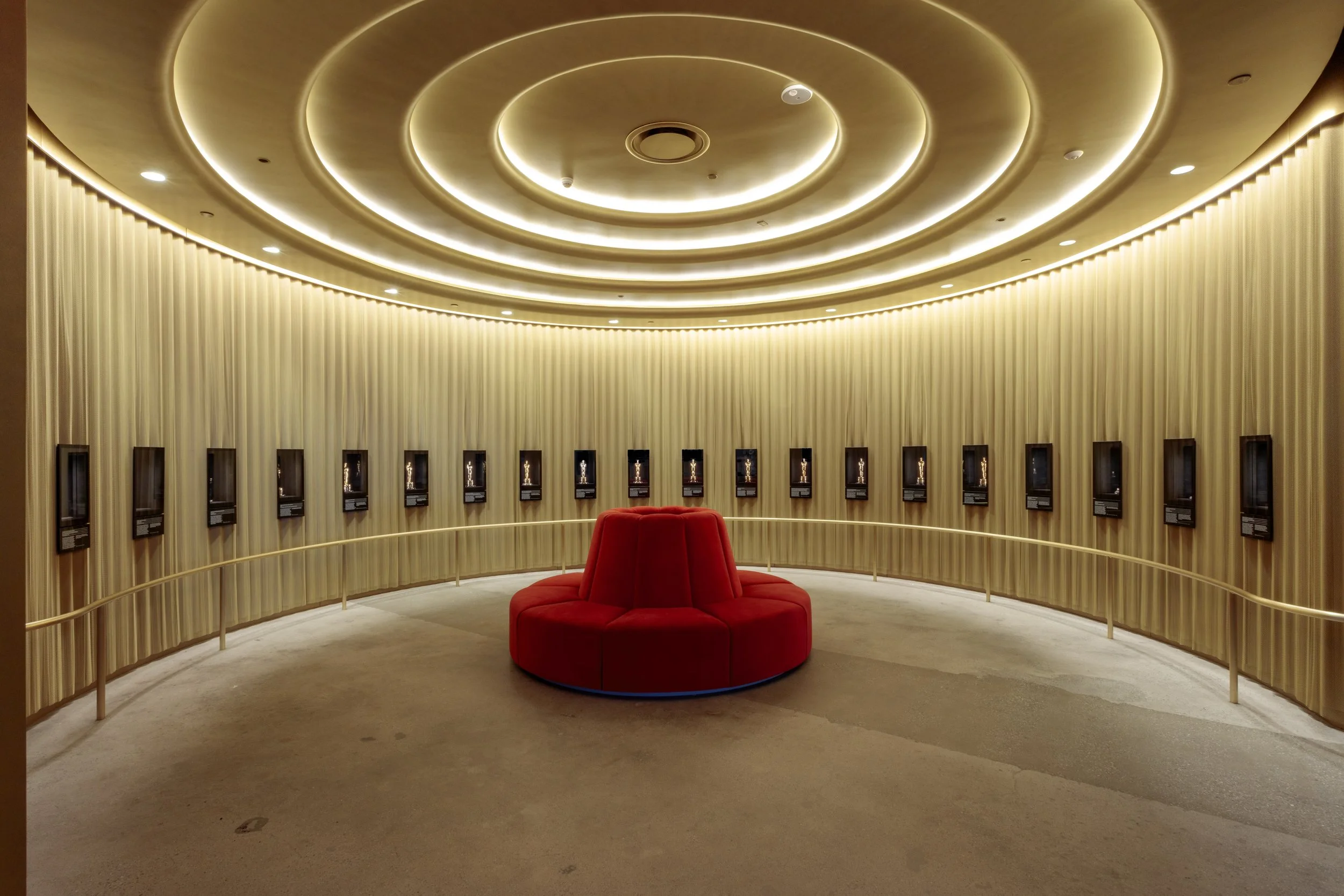
OSCARS GOLD
Anyone passing the Academy Museum façade at the intersection of Wilshire and Fairfax will have noticed the Streamline Moderne gold cylinder of the midcentury building, a detail often referred to as the “perfume bottle.” The galleries within the cylinder borrow from those iconic curves, most notably the Art Deco-inspired gallery which showcases 20 historic Oscar wins from 1927 to the present day. “We knew we wanted to contain the Oscars Gold in one space,” says Jarrod. “We didn’t want to scatter it everywhere, it was important to intensify that moment of encounter.”
The walls of the space are clad in an undulating curtain that serves to obscure the mechanics of the casework while complementing the play of light. “It's actually a double curtain,” explains Paula. “The first layer is covered in a gold metallic ‘chainmail’ that generates texture and scatters the light so you don’t get a big bounce of reflection. Then you have a second layer of satin beneath, giving the curtain that sense of weight and dimensionality.”
“It was important for the material to be durable, but we also wanted to maintain the soft waves and the impression of movement,” she adds. “There was long process of incremental adjustments to ensure that the light was consistent and the curtain hung naturally. We tried a series of velvets, velours, and silks, but the colors weren’t interacting with the light in the way we wanted – our goal was to create clean, linear bands of light that would evoke the cylinder of the exterior architecture. The effect brings you back to where you are in the building, contextualizing those historical Oscars within the building’s own heritage and its positioning in the city.”
ACADEMY RED
Given the cultural prominence of the iconic red carpet, you’d expect to see a lot of red at the Academy Museum. Ascending the elevators, you’ll catch sight of carpets so bright you’d barely dare to step on them, and the lobby is dotted with glowing red chairs and stools that move around the space like counters on a game board.
Red is the perfect complement to the silky grey of the concrete interiors, but one of our favorite applications of the color is even more dramatic – the sumptuous, oversized, red velvet couch in the Oscars Gallery. “Designing the furniture was a chance to introduce elements of curvature into the various galleries,” says Paula. “For the couch, we chose a really bright crimson velvet with a bit of tooth to it, so it has just a touch of brushed texture – enough to add some swirl and shadowing, set off by the gleam of the lights.”
“We wanted to create an overall aesthetic effect of glamour, while also carefully considering the relationship to the exhibits. How would the form affect your posture, how would it suit people of different heights, how would it allow you to interact with other visitors, and how would it effect sightlines around the space? The glow of the red draws you directly towards the couch, but how does your attention radiate outwards when you’re sitting there? Ultimately, the Oscars are the real focus of that room, so we needed to make sure that the red and the gold worked harmoniously together.”

ALMODÓVAR BLUE
Color plays an architectural role by impacting our perception of the dimensions of a space. Nowhere is this more apparent than in the gallery dedicated to the films of Pedro Almodóvar, where the color of the floor and the walls creates a hyper-charged atmosphere wholly different from any other area of the museum. “It’s the bluest blue,” says Jarrod. “We selected it by creating an inventory of the blues sourced from the posters for Pedro’s films, and identifying a highly saturated color which brought them all together. You’re completely immersed, in a vessel of sorts – the color carries you through from screen to screen.”
“There’s something very dreamlike about the space,” says Paula. “But at the same time, there’s a sharpness and immediacy, amplified by the bright red intro panel that greets you when you first enter the gallery. The color spectrum is expanded with the palette from Pedro’s own films – so the blue never becomes too dominant, it’s always in service to the works on show. That took a bit of fine tuning. Initially, the shade of blue was a bit brighter, but then it started taking over – it became the personality rather than the backdrop. The color is designed to heighten, but not to overwhelm – like the films themselves, it pushes the envelope, it tests what’s possible. It’s a matter of striking the right tone.”

CINEMATIC BLACK
The colors selected for the galleries are always in dialogue with darkness: the “cinematic black” of the theater auditorium. Variations on cinematic black include the deep blue of the Performance Gallery that explores casting and acting, and the dark purple of the Story Gallery featuring screenplays and storyboards. The costumes of the Identity Gallery – from mermaid tails to space suits – are set against an exuberant burgundy. “We did an analysis using extended checklists to find colors that would work for the long term,” says Jarrod. “Burgundy might not seem like the first guess for a museum environment, but it conveys this wonderful old world Hollywood feel, this sense of luxury. Also, it’s popping off anything that's red – and you’ll see it complements the Midsummer dress beautifully.”
In the space most conditioned by darkness – the immersive sound-bath featuring the film scores of composer Hildur Gunnasdottir – a pulsing red light provides a meditative point of focus and gently sculpts the corners and contours of the room. “Throughout the galleries, we were thinking about how to use light” says Jarrod. Often, black fabrics will have a slight element of reflection to pick up on the light of the projections, and the powder-coat matte black backgrounds of certain wall-installed display cases actively absorb light to allow the object to rise the foreground. Elsewhere, the application of the color black plays with different levels of translucency. The S-shaped glass wall in the Spielberg Family Gallery evokes the slickness and physicality of monochrome filmstrip, and the large-scale graphic lettering of the second-floor entry sequence reveals the flickering projections within the gallery space. Cinematic black is perhaps the most complex color in our palette – it’s alchemical, transformative, and multichromatic.
In a movie theater, the colors of the auditorium disappear the moment the lights go down – even if, as in the case of the David Geffen Theater or the Ted Mann Theater, the upholstery is a deep red or a glorious bright green. When translating the cinema experience to the museum context, we allowed the colors of the viewing space to coexist with the exhibits, engaging directly with the primary material of cinema which is light – reflecting, absorbing, emitting, shaping…
Likewise, functional fabrics become part of the performance. As you walk through the galleries, you’ll see variations on the curtain fold recurring as a design motif: curving casework and scalloped surfaces, fabric walls reminiscent of the bellows of an antique camera, and free-standing furniture that generates ripples and waves throughout the spaces.
It’s a fine balance to play with the acrobatics of the design while ensuring that the artifacts and projections take center stage. The dynamic push and pull between the exhibits and their setting creates whole worlds of sensory information – everything informs everything else, carrying the visitor through the galleries on a reel of color, sound, sight, and touch.
Originally published by WHY Architecture